Getting-Started–Launching-Tableau
11 Steps to Creating Visuals on Tableau
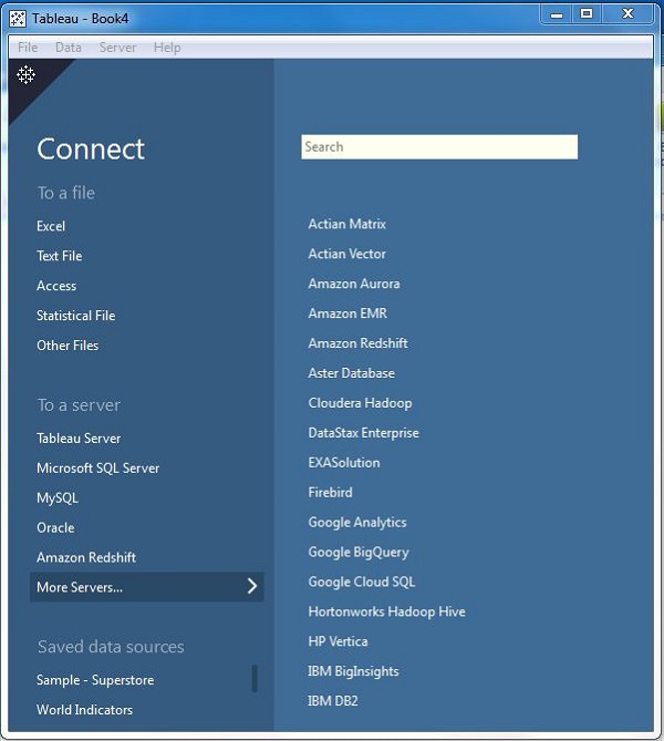
- Launch the app on your desktop ChromeOS does not support Tableau Desktop
- Connect Tableau to data source of choice E.g [community data 2022] (https://docs.google.com/spreadsheets/d/1RzU5DgjJf1hqWez1d29ZHZ-TkJkHYcdt/edit#gid=217844784)
- The left column shows the connection to the data source.
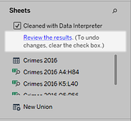
- Recommended: Check the box Use Data Interpreter, to clean the data
- Drag Ranked Measure Data file to the right blank sheet.
- Drag Additional Measure Data file to the right blank sheet next to Ranked Measure Data file to create a connection. The image below provides an example of what connecting tables looks like.
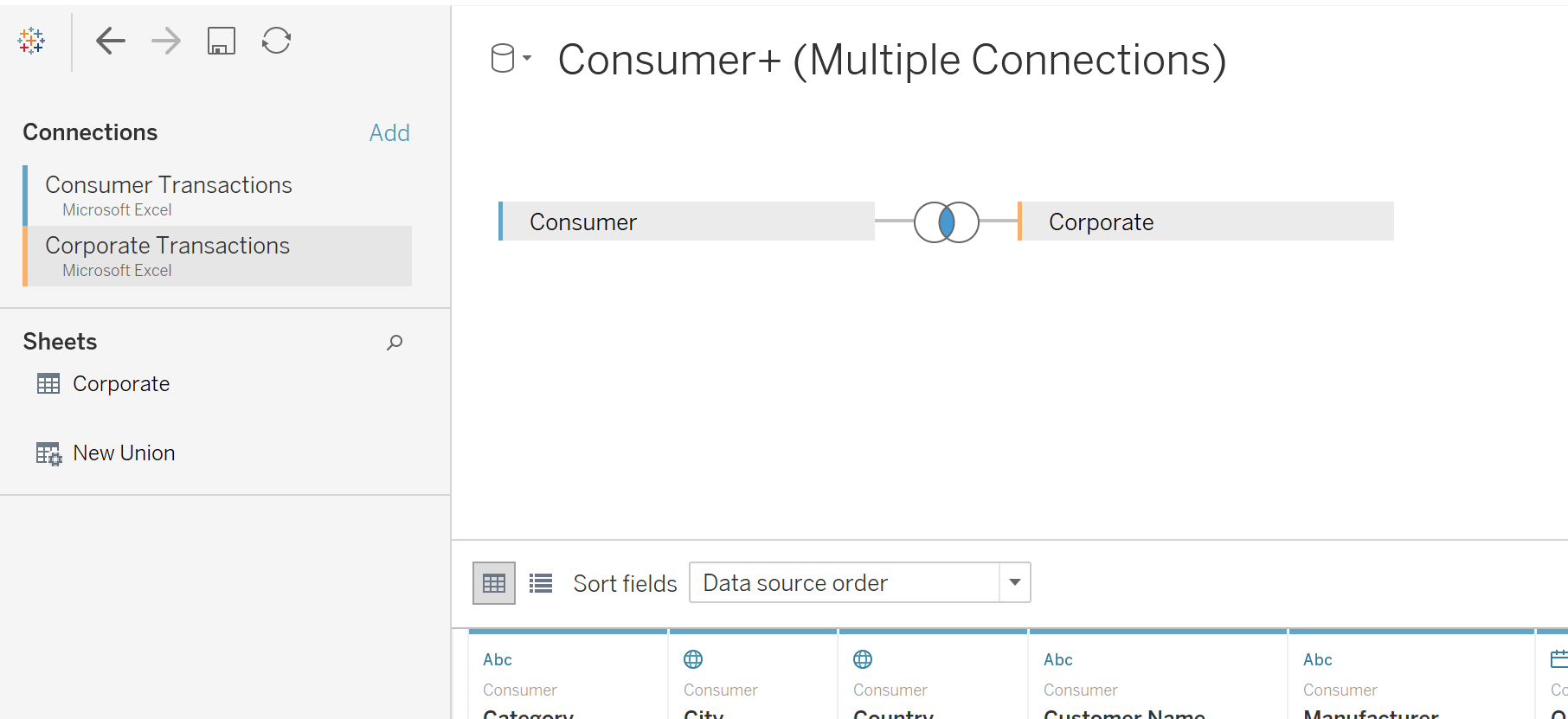
- To make this connection works modify the drop boxes below, and select FIPS for both or the same field depending on data source.
- Repeat the process for Outcomes and Factor Rankings Outcomes and Factor Subrankings, if you are using the community data. Multiple connections could be made depending on the data source of choice.
- Once the connection is succesful the red connecting line will turn orange.
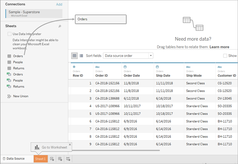
- Go to “Sheet 1” located at the bottom of the page to start creating graphs of your choice.
- Congratulations, you are ready to begin making visuals, drag variables to the Columns and Rows